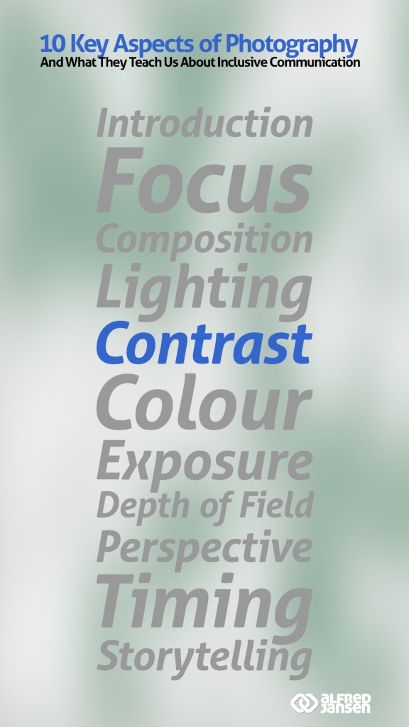
This week in my summer series exploring the connection between photography and inclusive communication, I’m turning the spotlight to contrast. Whether you’re composing a photograph or crafting a message, contrast is what brings clarity, energy, and focus. Without it, everything blurs together—and your impact fades.
This week’s topic: Contrast
In Photography: Making the Subject Stand Out
In photography, contrast is what separates light from dark, sharp from soft, or colour from neutral. It’s how I guide the viewer’s eye and highlight what really matters in the frame. High contrast can feel bold and dramatic. Low contrast might create softness, subtlety, or a quiet mood.
It’s not just a technical setting—it’s a storytelling tool. I use contrast to draw attention, to reveal hidden details, or to highlight emotion. Without contrast, everything looks flat. The story disappears.
In Communication: Showing What Matters
When I communicate, contrast plays a similar role. It’s how I make my message stand out. If everything is treated the same, people can’t tell what’s important. Contrast helps me set tone, create rhythm, and guide people through an idea. It can be as simple as using a bold sentence in the middle of a softer paragraph, or as powerful as pairing different perspectives to spark dialogue.
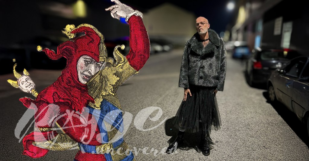
In inclusive communication, contrast also reminds me to respect differences—not smooth them out. We don’t all speak, think, or experience the world the same way. When we let different voices, styles, or tones sit side by side, we invite others in without asking them to blend in.
What I’ve Learned from Contrast
Contrast gives shape to everything. In photography, it gives images life. In communication, it brings messages to the surface. I’ve learned not to shy away from contrast—visually or verbally. A subtle hint of controversy—when used cleverly—sometimes helps. It’s what creates connection, energy, and honesty.
So next time you speak, write, or create, ask yourself: What’s the contrast here? What am I trying to highlight—and what needs space around it to be seen clearly?
Next Week: Colour
Next week, I’ll dive into colour—a vibrant and emotional part of both photography and communication. Until then, notice where contrast shows up in your own work. Is it helping people see more clearly—or is everything blending into one tone? Share your reflections, stories, or photos—I’d love to hear them.