Over the summer, I’ve been exploring how photography and communication overlap—and how much we can learn from one by practicing the other. With a background in journalism, design, and inclusive communication, I’ve found that tools like focus, composition, and light aren’t just useful behind a camera; they’re just as powerful when you’re trying to get a message across.
This week, I’m diving into colour—how it works in photography, how it plays a role in communication, and how you can use it more intentionally in your own work. Whether you’re writing, presenting, creating content, or simply having conversations, colour offers clues, context, and emotion.
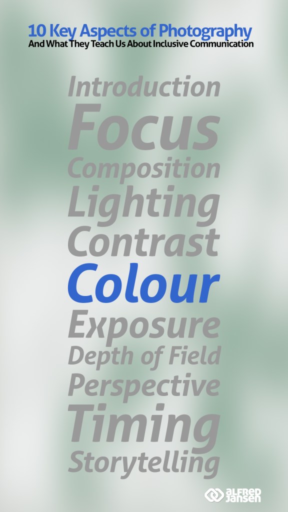
This week’s topic: Colour
Finding Your Tone Through Colour
When I work with photography or communication, colour is definitely one of the things I pay attention to—and maybe you do too, even without realising it. Colour sets the emotional tone. It can energise, calm, surprise, or build trust. In photography, colour helps tell a story, create atmosphere, and guide the viewer’s eye. The same goes for communication: how we use colour—visually or metaphorically—affects how our message is received.
Even when I choose to go black and white, that’s a colour decision too. Monochrome photography can strip distractions, spotlight emotion, or offer a timeless feel. In communication, “black and white” can suggest clarity, contrast, or even rigidity. Knowing when to use a full spectrum and when to simplify is part of both crafts.
What Colour Means in Communication
You already use colour in your communication choices—whether it’s the visual layout of a presentation or the emotional “colour” of your tone in a conversation. Bright, vibrant language can uplift, while muted tones may signal calm or caution. If you overdo it, the message can feel chaotic; if you underplay it, it might go unnoticed.
Using colour with intention can help you connect with more people in more inclusive ways. Think about accessibility—choosing colours that everyone can see and feel included by. Or think of culture—understanding that certain colours may mean different things to different communities. When you’re aware of how colour shapes meaning, you can be more thoughtful, more respectful, and more effective in how you communicate.
The Creative Overlap
I’ve learned that photographers and communicators both benefit from thinking about colour in layers. Whether you’re crafting a brand story, leading a workshop, or capturing a scene with your camera, colour can be a tool for clarity, empathy, and presence. You don’t need to be a designer or an artist to use colour well—you just need to ask: What feeling am I creating here?
So next time you sit down to write, speak, or share something, take a moment to reflect on the colours you’re using—literally and metaphorically. They may say more than your words ever could.
Coming Up Next Week:
We’ll dive into Exposure, and how adjusting light—both in photos and in our messages—can reveal or hide the heart of what we want to say.